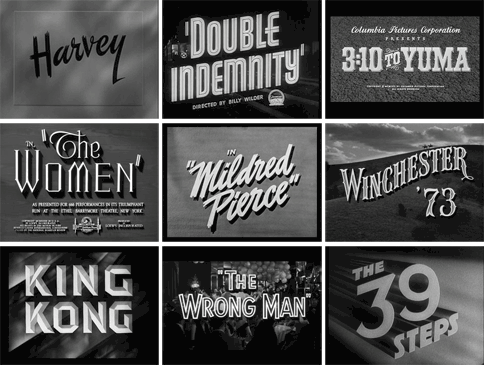
You might not realize it (I certainly didn't), but the font choice in a movie title can say a lot about the film even before you watch it. I recently embarked on a journey to understand how different fonts can set the tone and evoke certain emotions in viewers.
Fonts are more than just letters on a screen; they're like the wardrobe of a film, helping to establish its personality and mood. Picture this: you're scrolling through Netflix, looking for a movie to watch. Suddenly, you stumble upon two titles: one in bold, blocky letters and another in elegant, cursive script. Which one catches your eye first? Chances are, the font played a significant role in your decision-making process. The Cambridge viewers have no choice but to watch my film opening, but you get the idea.
Different fonts can convey various emotions and themes. Some even have built up their own stereotype. For instance, serif fonts like Times New Roman or Georgia are classic and traditional, often associated with historical dramas or period pieces. On the other hand, sans-serif fonts like Helvetica or Arial are sleek and modern, fitting for contemporary stories or action-packed thrillers.
But what about dramedies? These quirky, heartfelt films blend elements of drama and comedy, requiring a font that strikes the perfect balance between seriousness and lightheartedness. After some careful consideration, I've narrowed down my font choices for my dramedy movie about the chorus teacher:

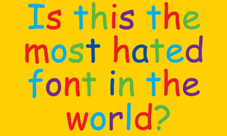

Ultimately, the choice of font for a movie title is subjective and depends on the specific tone and themes of the film. In addition, I think it will be up to when I actually place the title card. The Comic Sans MS approach could only work if it was placed in a comedic portion of my film opening. Currently, I'm leaning towards Garamond. As I continue to learn about the art of storytelling, I'm reminded that every detail, from the script to the font choice, contributes to the overall cinematic experience.


No comments:
Post a Comment